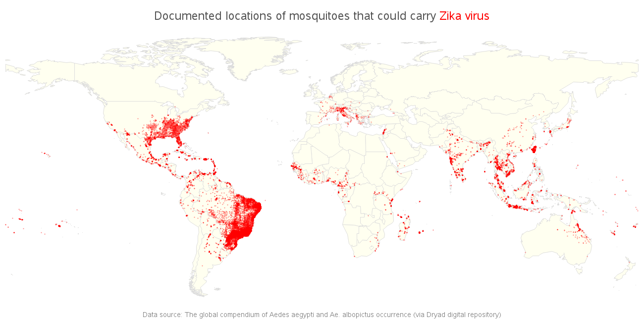
Earlier this month, the World Health Organization (WHO) has declared the Zika virus a global public health emergency. The virus is spread by the so-called Aedes mosquito, which can be found in countries on every continent. Mapping the location of the mosquitoes should therefore give us a pretty good idea of where the virus might spread.
But there’s a difference between mapping and mapping, as SAS’ graph expert Robert Allison has amply demonstrated throughout his career. So he decided to take an existing graph from an article in Nature as a starting point to create an even more insightful and useful map.
He downloaded their csv file, opened it in Excel and saved it as an xls spreadsheet, which he then imported into SAS. From then on, he could work his magic using SAS graph.
The original article did a decent job of plotting the data, but Robert still managed to make a few improvements. Rather than using red dots on a medium gray map, he used red dots on a very light yellow map - because higher contrast makes it easier to see the red dots. Also, instead of using solid red dots, he used alpha-transparent red ... this way the red is darker where several dots overlap, and lighter where the dots are less dense. And finally, he added html hover-text so you can hover your mouse over the countries, and see their names. The result looks like this: a more insightful and more manageable overview of the locations where the mosquitoes can be found, and an easier way to get access to the underlying data.
When you compare both maps, you will notice the differences. Not only is Robert’s map more insightful, it also provides you with a more manageable source of information, which may come in handy in the near future, for other research. Visualization and ease of use do make a difference, and - especially with health-related issues - even small differences can lead to big results.